286
Local Forecast / Re: General LF Discussion
« on: November 23, 2014, 08:01:39 PM »To save money I would assume. When it comes to STARs, they would only have to worry about maintaining the IS2 rather than the IS/IS2 together on different feeds. That's just my guess though.
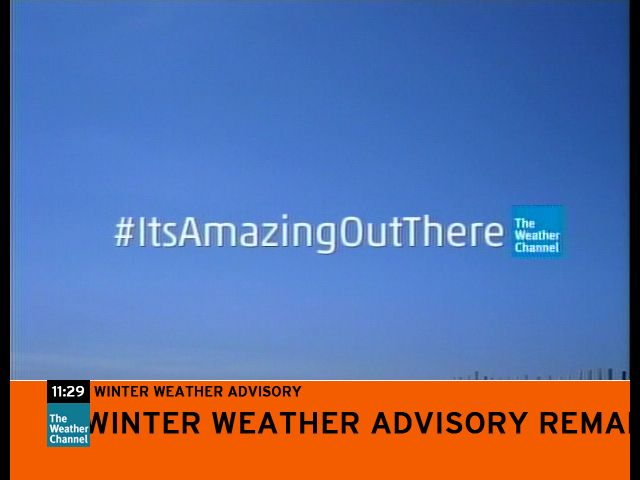
Yeah. I think it's a whole lot easier just having to deal with one "feed" or format. As has been discussed here a lot, many other stations just letterbox their HD feed for SD, ESPN/ESPN2 being a prime example that comes to my mind at this point.
If the headend has switched over to the HD feed simulcast for The Weather Channel, that I guess that means they no longer want their SD IntelliSTAR units, right? If that's the case, then I guess that the headend would have to send the units back to TWC HQ, wouldn't they?


 You haven't scared me away or anything like that. I totally understand about the troubles you've been going through recently, believe me. Wishing you the very best of luck, man.


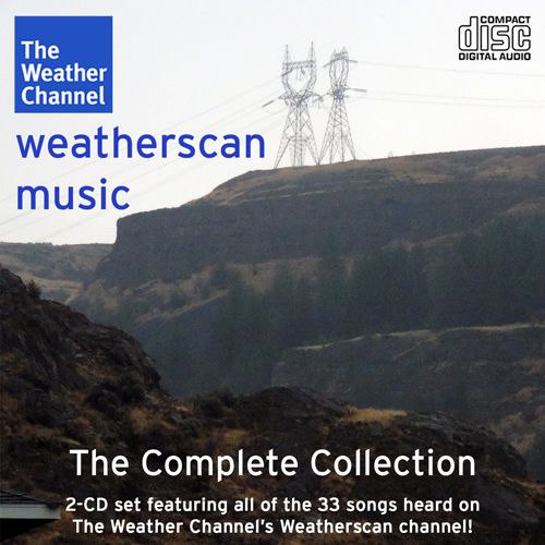
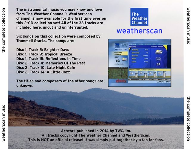
 IMO, this is probably the best version of the Wxscan Music CD Artwork that I've ever made, compared to the previous versions.


